CRO Experimentation
Having worked with Hillarys for 5 years, I've served as the design lead for our Conversion Rate Optimisation (CRO) initiatives. These tests have varied from adjusting minor page elements to completely redesigning user journeys. Below are a few examples of some of our successful tests.
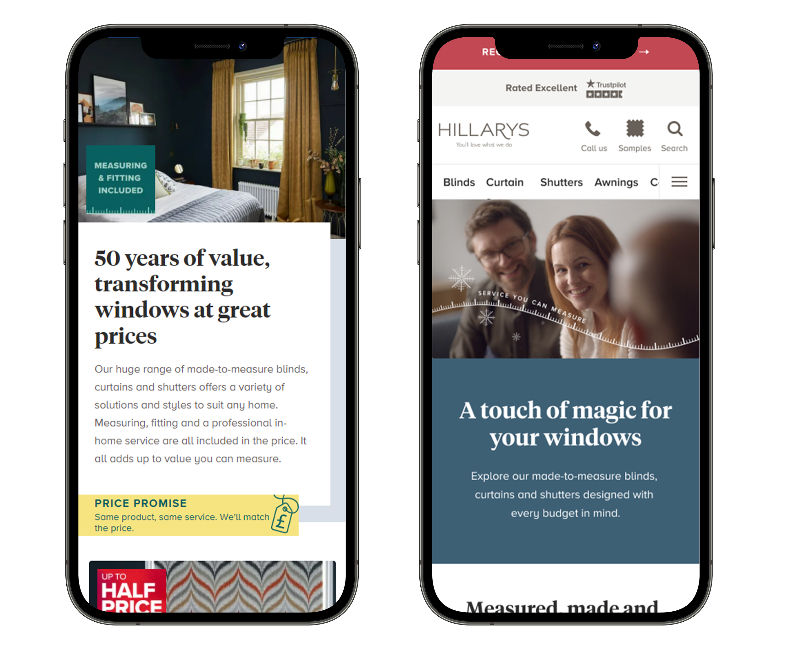
Hillarys homepage redesign
The problem: The Hillarys homepage had started to loose it’s way a little so to kick start a project where we could look at the benefits of a redesign I went about setting up a survey / preference test for the old vs the new page.
This survey gave us many positive signals that the redesign was the right progression for the brand.
The idea: A new homepage design that is more modern and contemporary whilst explaining the Hillarys unique service clearly.
The results: The redesign resulted in a conversion rate increase of +8.2%, Sample conversion rate increase +6.9% and a reduction in Exit rate of -3.1%
Hillarys Pricing examples
The problem: Due to the nature of Hillarys in-home service, specific prices are not available on site. We heard multiple times in user testing that users wanted at least a guide price before they progress to booking an appointment.
The idea: We designed a component that sat on each product category page. This component shows a user what the average price is for a blind to be measured, made and fitted in a small, medium and large window.
The results: We measured the behaviours of each user all the way through to purchase. This test resulted in a 4.8% uplift in in-home conversion and a revenue increase of £4.7% during the test period.
Personalised shutters landing page
The problem: We were seeing a poor in-home conversion rate for shutters and wanted to better educate customers before their appointment to manage expectations and ensure they booked the right advisor. Initially the user landed on the appointment form directly from social media.
The idea: We built a highly focused and targeted Shutters landing page with information about the product and service just before the appointment form.
The results: We measured the behaviours of each user all the way through to purchase. This test resulted in a +21% increase in average order value and a 8.3% increase in in-home conversion .
Icons on Blinds landing page
The problem: The blinds landing page is a navigational page where a user is looking to select the type of product they’re interested in. We believed that the the imagery on this page wasn’t clear to the user and so choosing the right blind was proving difficult.
The idea: Having seen the success from using icons in the pricing component we wanted to try using icons to aid navigation on the blinds landing page.
The results: This test resulted in an increase of on-site conversion of 1%


